


What Leanne Ford taught me about white walls
A color confession I never thought I’d make...

I’ve built a whole design philosophy and business around embracing bold, joyful color. So it might not surprise you that white paint rarely enters the chat.
To be fair, white gets a bad rap (I’m fully guilty of contributing to this!). I’ve always associated it with unfinished spaces or “landlord specials” that feel like placeholders more than deliberate choices. But that’s not fair to white. Not all white spaces feel soulless. In fact, some of them are… downright beautiful.
*sigh* I know, a little unexpected from me?!
One of my design heroes is Leanne Ford, the queen of white paint and a lover of anything “light, bright, and airy.” When I met her at a book signing last year, I told her how much she’d inspired me to start my design business, but that I was firmly in the “colorful interiors” camp. She grinned and said, “Well, white is my color. Yours is... every other one!” We both laughed.
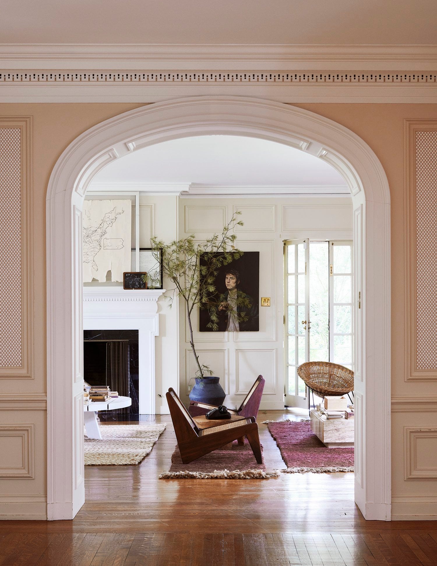
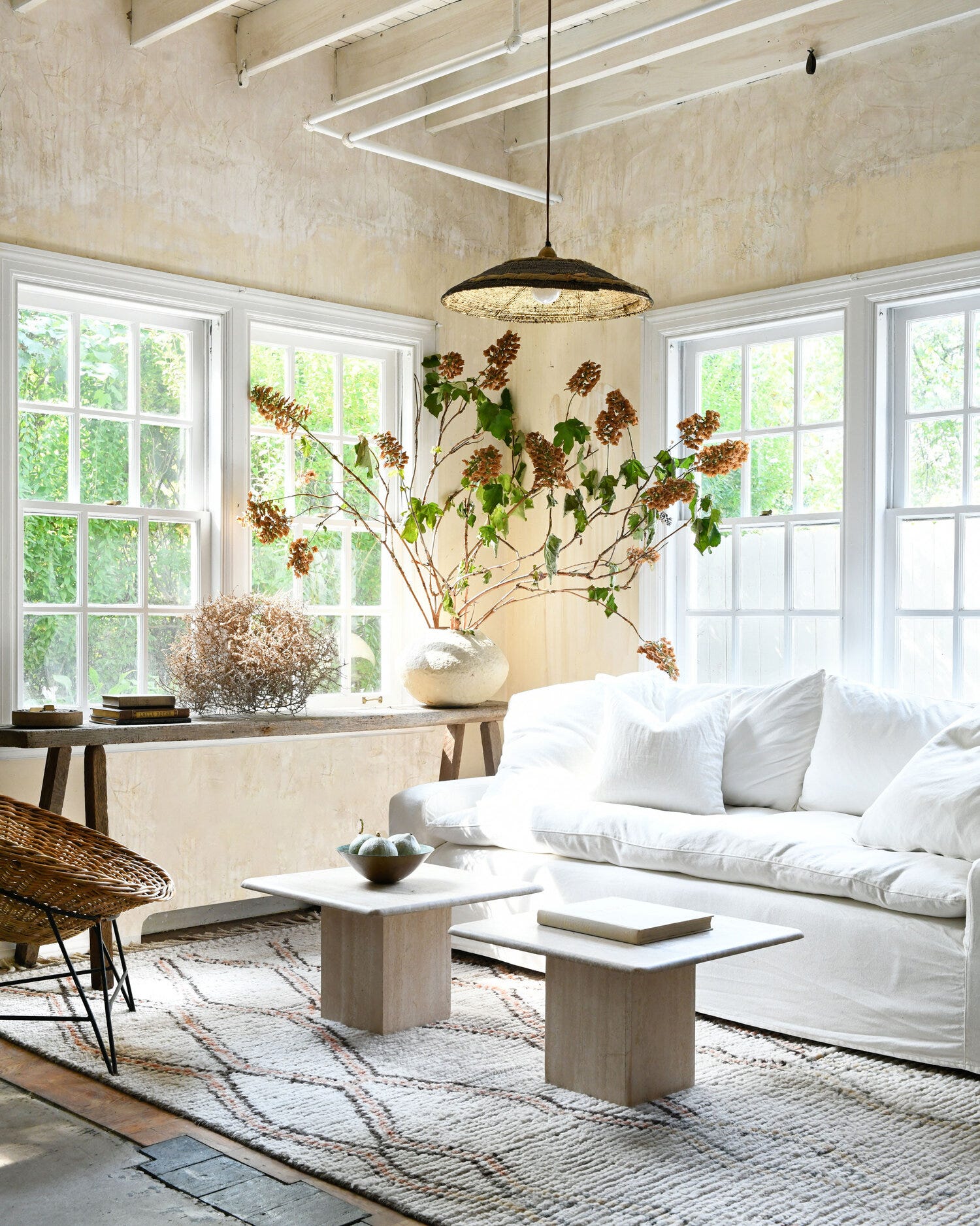
I think about what she said all the time: White is my color. For Leanne, white isn’t a lack of color. It’s a commitment to softness, quiet, light. She also says having white walls makes a space feel more timeless. She uses white the way I use bold color: to create a feeling, not just to fill space.
That made me pause. Because even though I don’t typically reach for white, I kind of get it.
White paint is a reset. It clears the visual noise. And for some people, it’s the blank slate they need before they can even begin dreaming in color. I’ve recommended it to clients who need to “wipe the walls clean” of a former home’s energy, so they can get quiet before it gets loud again.
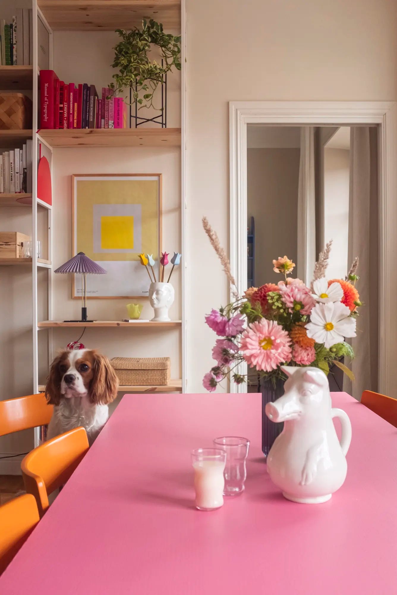
The truth is, white and color aren’t enemies—they’re actually great co-stars. Plenty of designers use white as a backdrop to let other colors take the lead. Even I was briefly tempted when I moved into my place in Hudson, with its beautiful white floors and walls, to leave it all untouched and channel my inner Leanne. But I know myself. I can’t not layer in more color. It’s just how I’m wired. Sorry, not sorry!

But now, I’ve come to appreciate white paint in a new way. With caveats! Not as a default or backup plan, but as a backdrop with a purpose. My issue has never been with white itself. It’s when white is used out of fear or without intention.

If you’re living with white walls but are tempted by color, here are a few ways to make the two work at home:
Use white as your canvas, not your whole story
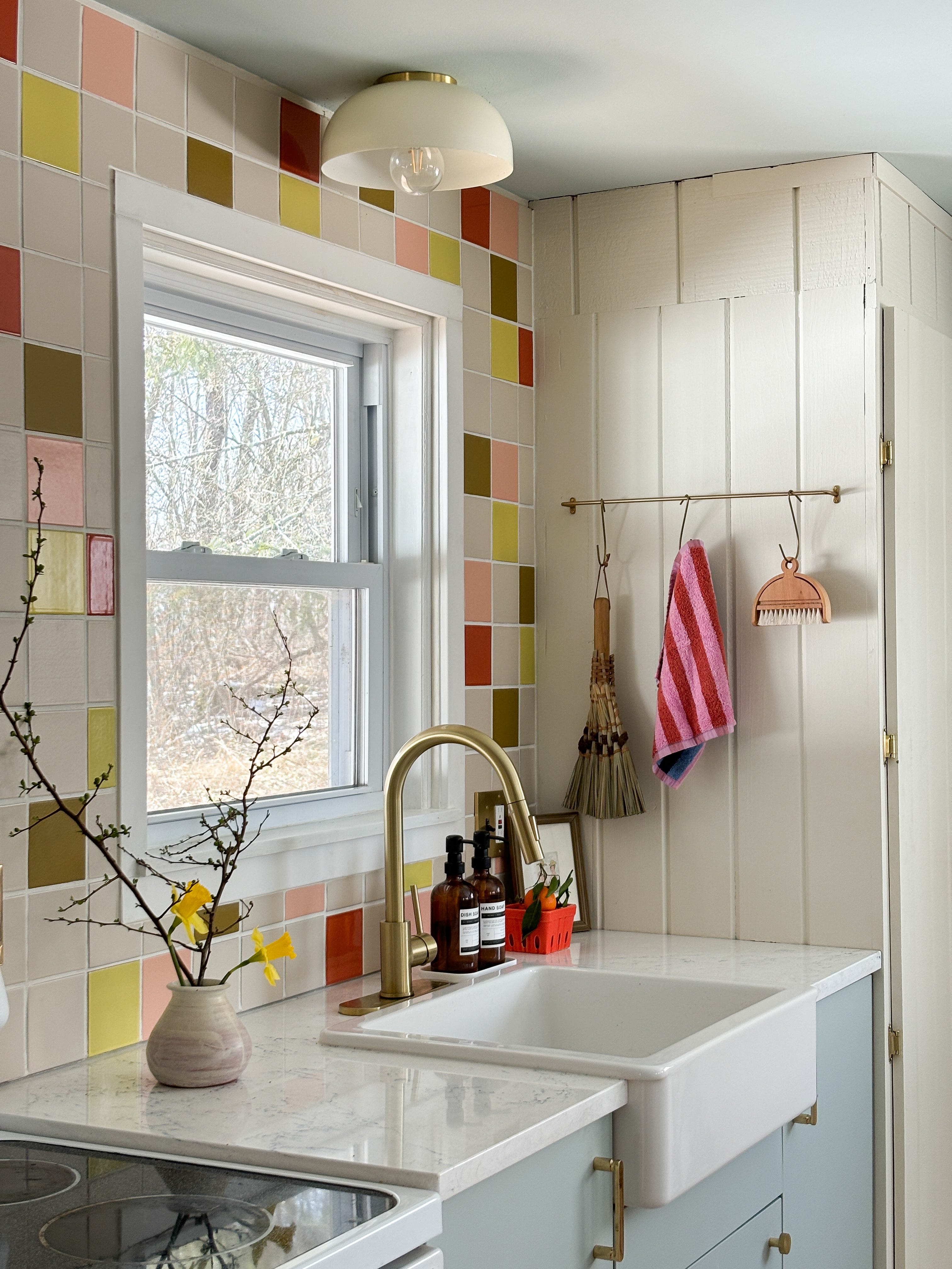
White walls can be the perfect backdrop for statement furniture, bold artwork, or brightly colored anything. If you go this route, you want to let the color live in the objects, not the background.
Get specific about your white
There’s a big difference between warm, creamy whites and cool, stark ones. Leanne’s signature whites feel comforting and soft, not icy or clinical. The shade of white you choose will depend on your personal preference and the other colors and materials surrounding it in your home.
Layer your textures
White looks best when it’s dimensional and layered. You want variety! Think limewashed walls, mixed fabrics, rough woods, metals. It needs movement to keep it from falling flat.
Don’t be afraid of contrast
White walls can handle bold trim and doors or moody built-ins. The contrast actually gives the space more clarity and lets it feel like its own moment.

I’m still a color maximalist, and I’m still not painting my whole house white. But if white feels like your color? Go for it. Just promise me it’s a decision, not a default.
xo Daniela

I have tried and failed with white walls, but when you get it right - it’s sooooo good!!
I *love* the white walls with the colorful doors!!!